
Color Strategy for Sensory Experiences
Your Brand Is What People Feel & Remember.
Not Your Visuals.
For brands that want to create intentional experiences, beyond visuals.
If people didn’t see your brand,
would they still feel & remember it?
As seen in


Color is not decoration.
It's strategy.
It speaks faster than words.
It's the first signal the brain processes, immediately shaping how we feel.
Does Your Brand Actually Work?
You built something that looks right. But in practice you are:
Blending in
Visibility is expensive and forgettable. More content, more campaigns, more noise — but growth is slow.
Wasting resources
Teams over-revise and overthink. Campaigns take longer, cost more, and struggle to land.
Lacking alignment
Execution is inconsistent. Engagement is low. Turnover is high.
This isn't a marketing problem. It's a systems problem.
What a Strategy-Led Brand Does
When your brand is built on a reliable system, everything changes.
01
From Blending In
→ To Standing Out
A brand that feels distinct, recognizable, and worth paying for
02
From Wasting Resources
→ To Less Effort
Less output, less budget, stronger impact, and faster campaign execution
03
From Confusion
→ To Clear Direction
A clear framework that speeds up decisions and keeps everyone engaged and on the same page
A brand is the meaning and emotions people feel and remember. Consistently.
A real system
Science → Framework → Application
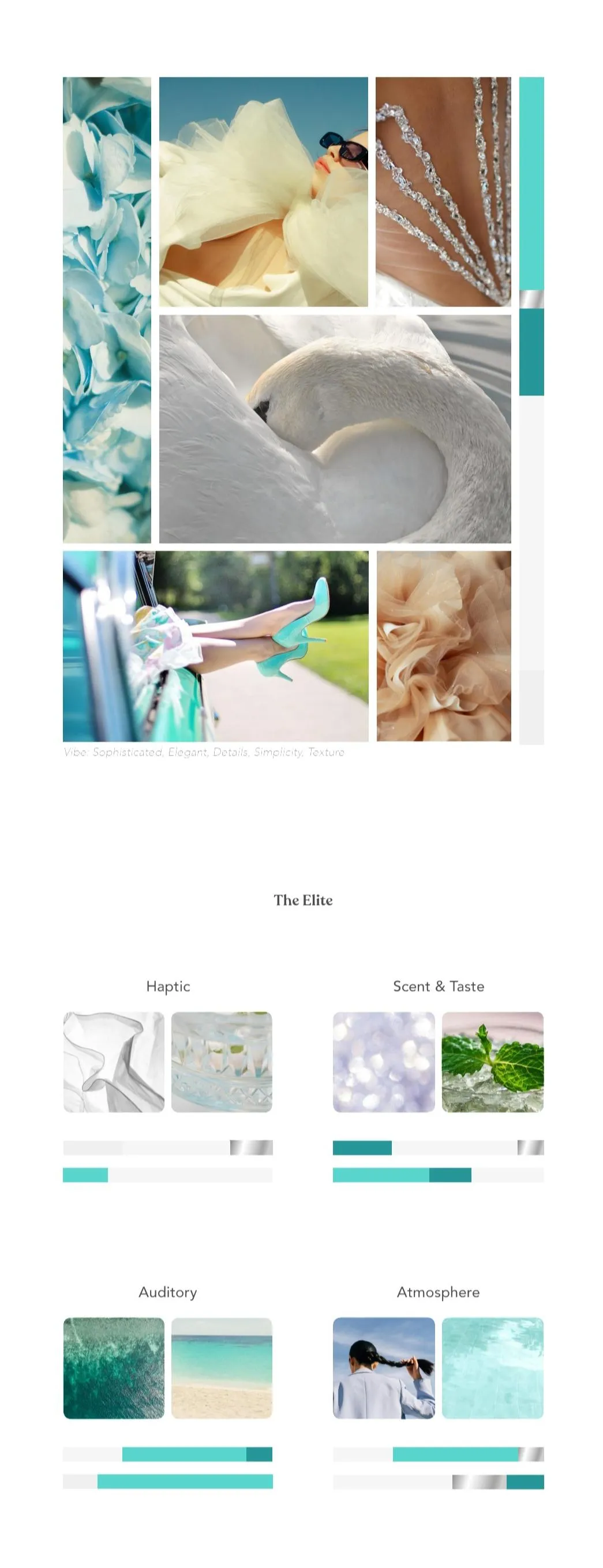
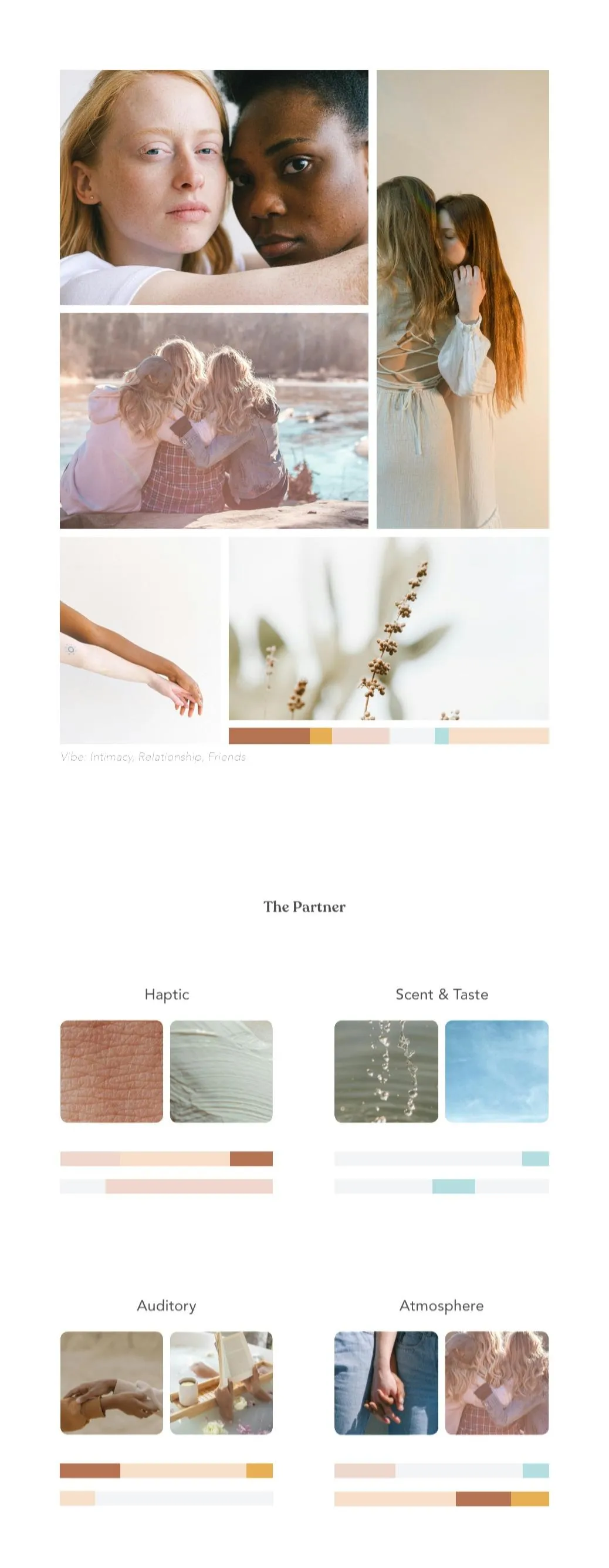
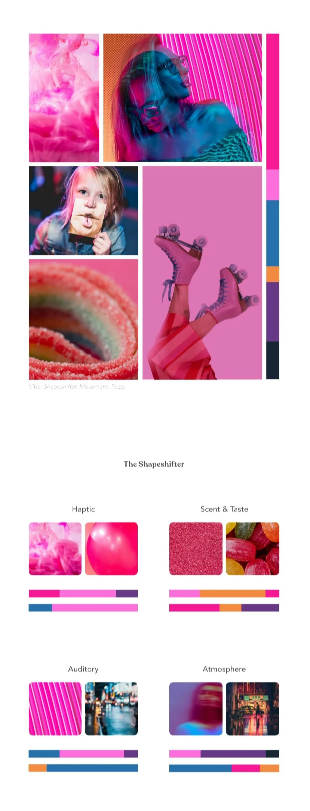
The ChromaSense framework draws from perception science, Gestalt psychology, neuroaesthetics, and Jungian archetype theory to build brand experiences that operate at a subconscious level — before logic, before language, before any conscious decision.
🧠
PERCEPTION & BRAIN SCIENCE
How the brain processes color, form, and sensory input — before any conscious thought occurs. Why some experiences feel coherent and others feel "off."
🔮
JUNGIAN ARCHETYPE PSYCHOLOGY
The 12 brand archetypes as psychological energy systems — not surface labels. How they connect to color, tone, and the subconscious patterns your audience carries.
🎨
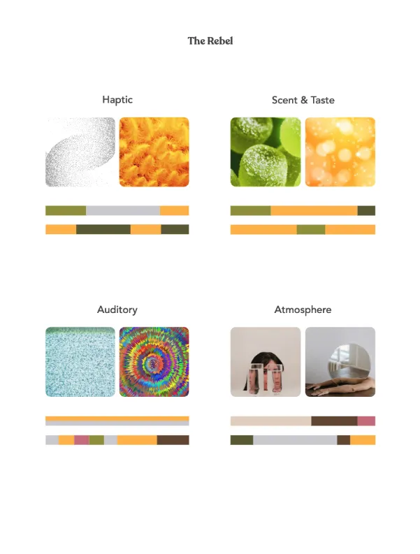
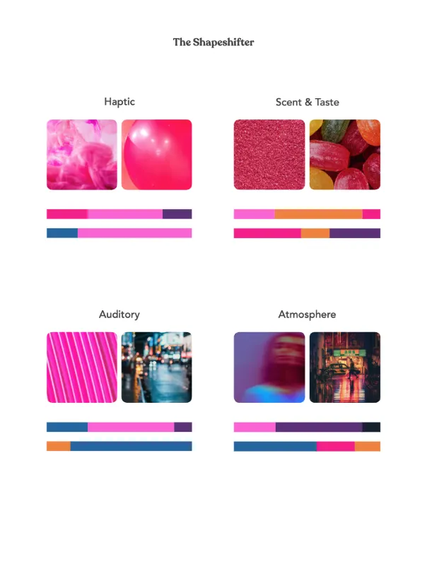
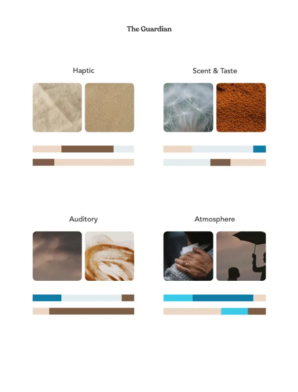
CHROMASENSORY PALETTE
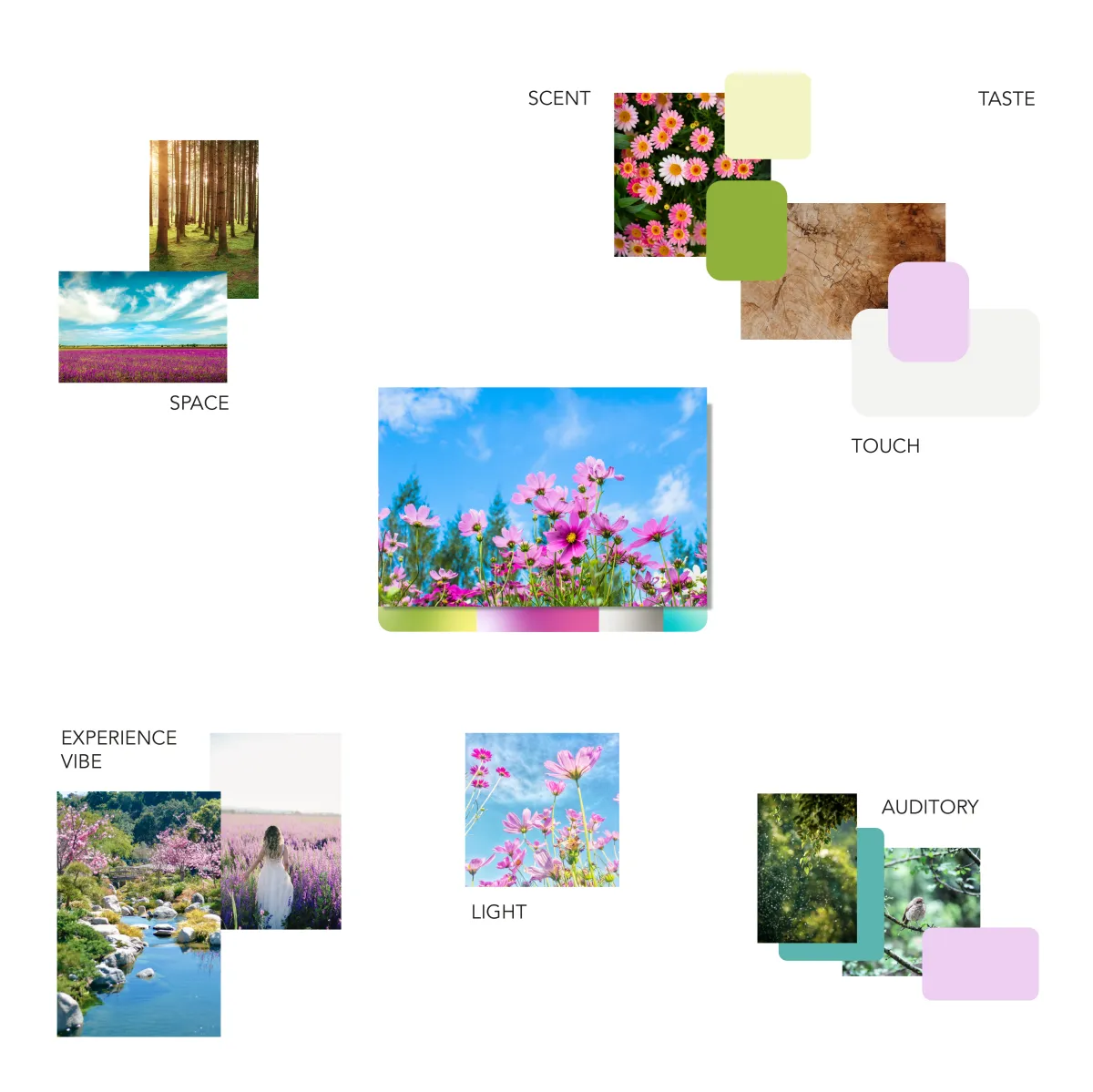
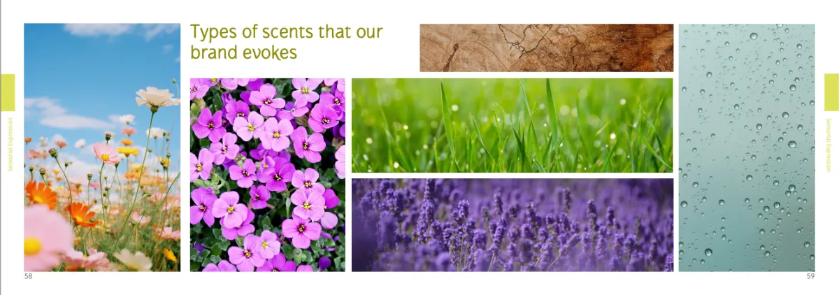
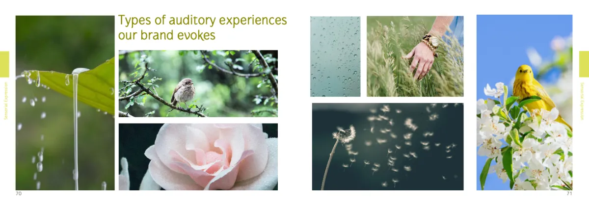
How color works as a multisensory signal — affecting taste, sound, temperature, and memory. Designing color systems that work across all senses makes your brand more inclusive and more impactful for everyone.
• IACC Certified Color Consultant
International Association of Color Consultants
• Fine Arts Degree
2013: Thesis on color perception & the anomalous mind
• Master's in Advertising
Applied color and perception in communication
• 15+ years
Researching and applying color strategies in various contexts
Applied ChromaSense
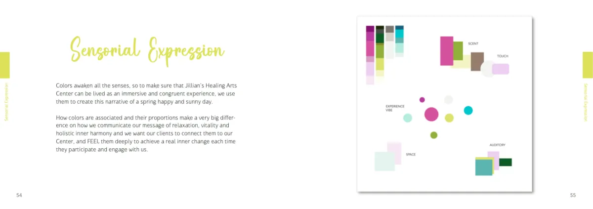
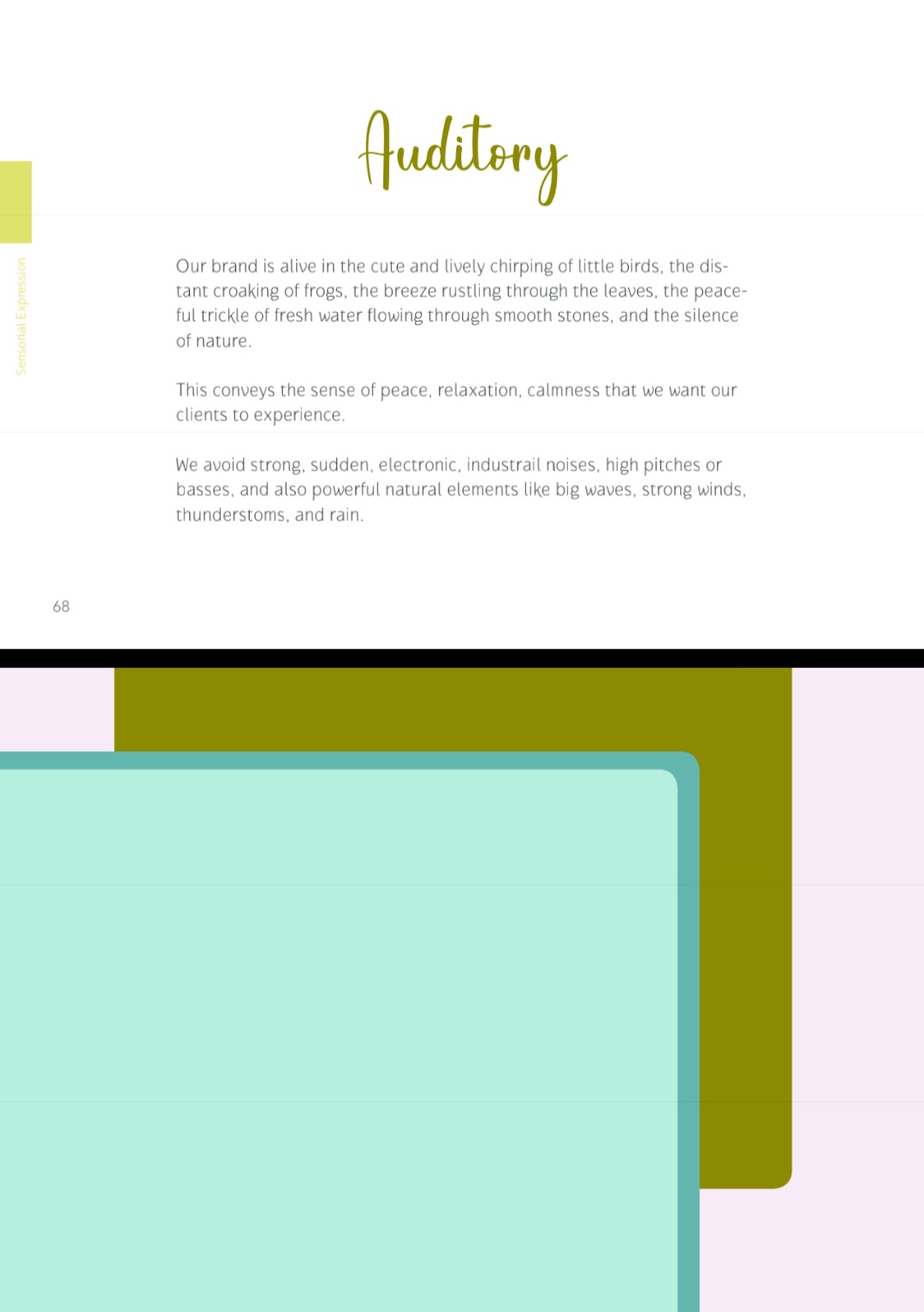
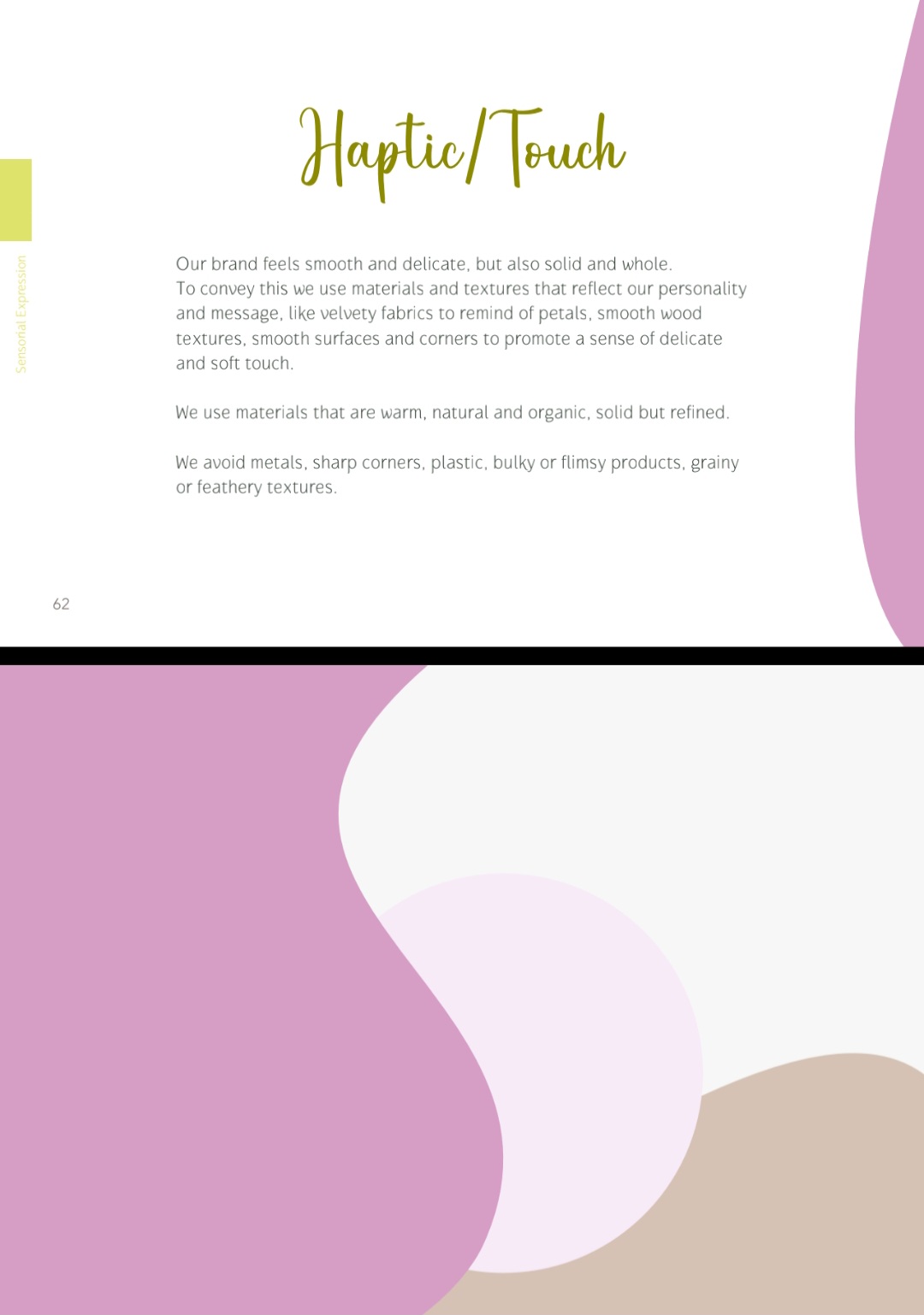
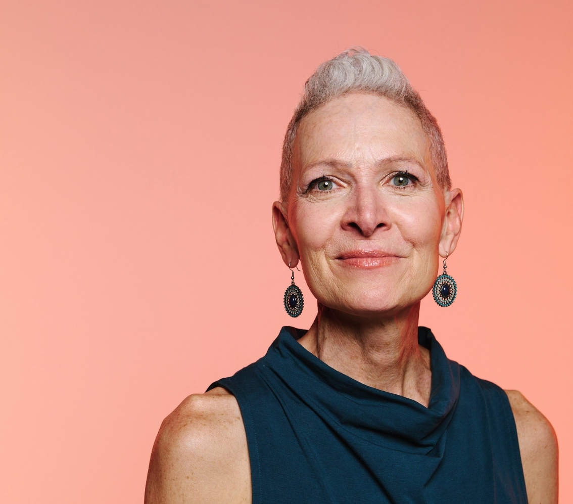
JILLIAN'S HEALING ARTS CENTER
Jillian runs a wellness studio. She is also blind.
She needed a brand that helped her make confident decisions across every touchpoint: what to wear for TV, which materials to choose, how to speak publicly about the studio.
We built a sensory brand strategy. Not a logo. A complete framework: color palette, material direction, spatial experience, communication tone.
⭐ ⭐ ⭐ ⭐ ⭐
"Thank you for your help! I already knew which towels to buy, which materials would fit perfectly. The interview was the easiest thing I've done for the public. I already knew what to wear and what to say."
Jillian
People don't need to see your brand to feel it.
A multisensory approach makes experiences more accessible, more inclusive, more memorable — for everyone.
Beyond Visuals
FOR ACCESSIBILITY & INCLUSION
Most brands rely almost entirely on visual perception — excluding millions of people and limiting emotional impact for everyone.
A multisensory approach changes that.
When your brand engages multiple senses — not just sight — it becomes:

More immersive and memorable for everyone
Multisensory experiences engage the brain more deeply, keeping people more grounded in the present. This reinforces brand memorability by up to 70% more comparing to visual brands.

More accessible to people with impairments
People who cannot see your brand cannot experience it.
Creating a congruent multisensory system allows everyone–no matter their abilities–to recognize your brand in any context.

More consistent across all touchpoints
It's easier to expand the brand across physical spaces, digital experiences, and spoken communication, while maintaining a consistent experience.
Multiple Applications
Color Strategy
Training
Color strategy for teams and creatives who want to use this tool more intentionally, not just intuitively. Go beyond color theory basics to learn how to build sensory palettes, optimize communication, and stop second-guessing your chromatic decisions.
Brand
Consulting
Strategic frameworks for businesses that want more than visuals. Build a brand system that improves alignment, accelerates decision-making, and creates a more distinctive, accessible, and memorable presence across every touchpoint.
Brand
Photography
A cohesive library of images built around your archetype, palette, and visual identity, so every image reinforces who you are and what you stand for.
For businesses and creatives who want more than "pretty pics".

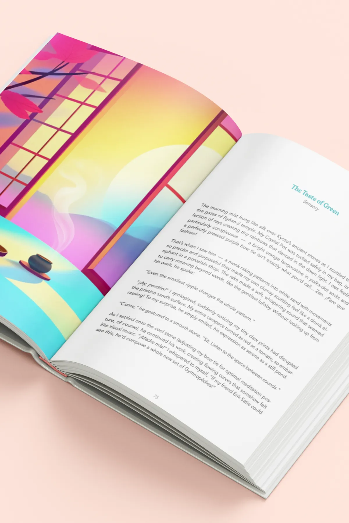
Colors & Fairy Tales Book
A practical system for applying color beyond aesthetics. Through sensory storytelling, archetype-deep dives, and color strategies, the book helps you build brands that feel meaningful, memorable, and strategically coherent.
What Clients Say
I’ve never seen anyone talk about branding the way Meg does, it’s brilliant! Really opened my eyes to how much more depth and meaning we are able to share!

Thank you so much for your support and love! This interview was so much more easy than anything I've done for the public before. Because of your help! I knew how to speak confidently. I knew what to wear based on the branding. All I have to say is thank you! You are the best!
I had an eye-opening and mindset-shifting call with Meg! She knew exactly which questions to ask to get to the essence of my brand values and gave me wonderful insight into an analysis of my current branding and how I could improve. After the consultation, I felt empowered knowing exactly what I needed to do and what I want to represent as I hadn’t been asked those questions before. I’ve felt in good hands, thank you Meg for all the value you have given me!

Omg Meg! The way you sense and feel for colors and use them for an immersive experience - wow wow wow! But also, the way you teach and connect concepts — maybe with your book, I’ll finally get a bit of feel for colors!

After the rebranding, I posted my new course on social media and someone commented “what a beautiful way to show people what the space FEELS like through graphic design, font and copy.” So exciting!

Fascinating! I love how you have brilliantly integrated archetype psychology into a super accurate model to help others (myself included) with the misguided idea of branding and what truly entails!

I am happily engaging my entertainer and explorer archetypes as I write about my new offer! I am having a blast! Ideas, colors, words and more are free flowing like never before! Thank you so much!
Meg is very knowledgeable and has helped me to clear my focus and resolve some doubts I had about colour and Instagram. After our call I was full of ideas on how to make my brand stand out more.

I used to think I was really bad with colors until I met you! Well, I could still be really bad at it, but at least now I choose based on feelings more—I choose colors confidently.
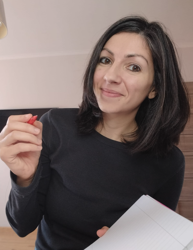

¡Hola!
I'm Meg, an IACC-Certified color consultant with a background in fine arts and advertising.
I have synesthesia: sounds, textures, and sensations appear as colors. About 15+ years ago, I realized not everyone experiences life that way, so I started exploring human perception. Eventually, I developed a system to create more meaningful experiences.
My trainings and book, Colors & Fairy Tales, share that system through the methodology itself.
Discover Your Brand's True Colors!
What colors TRULY represent your brand's personality, values, and energy?
Uncover the palette that best communicates who you are!
Ready to explore how color elevates your business and life?
Color & Brand Strategist for Sensory Experiences - Copyright @Meg Rouje 2026